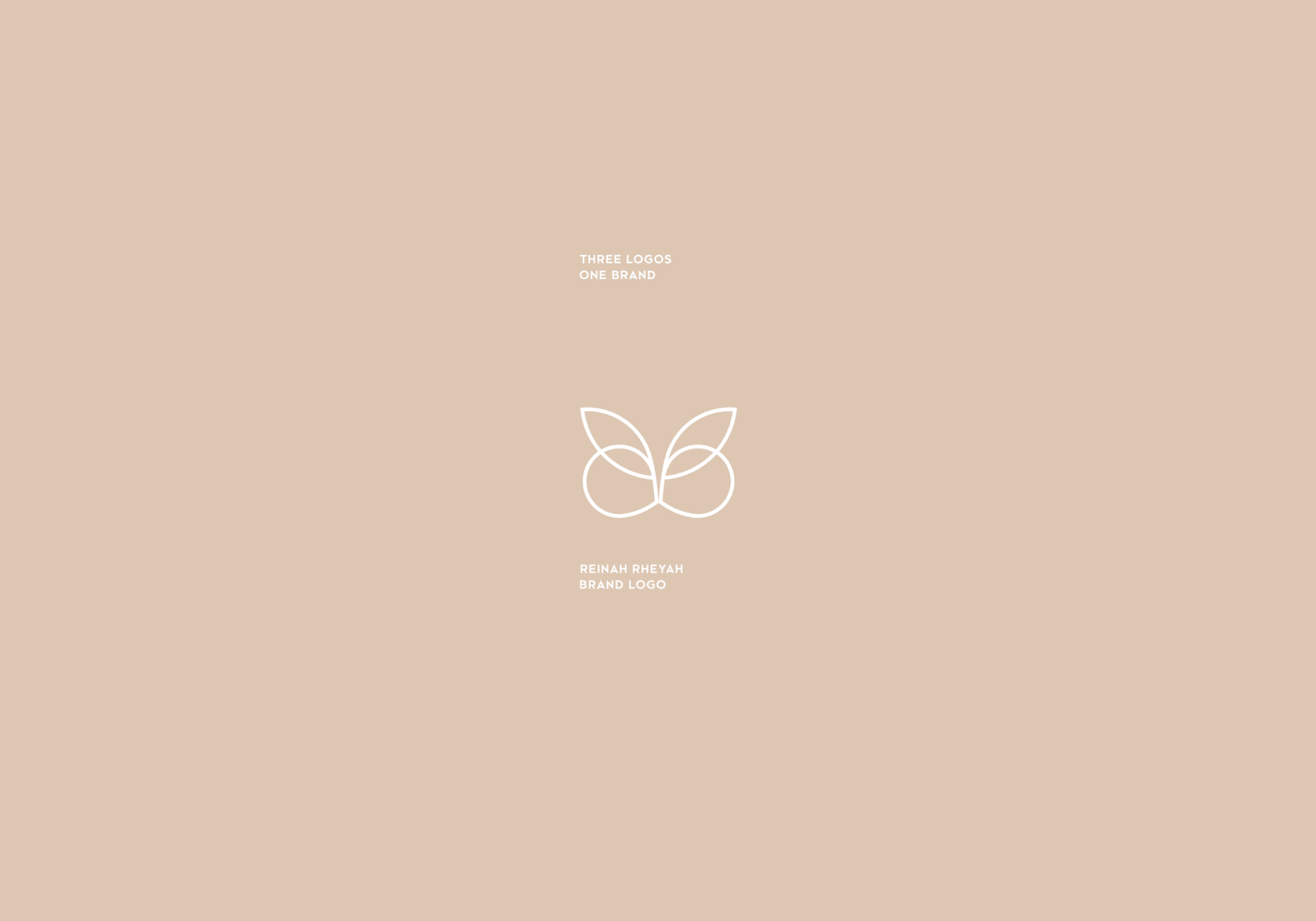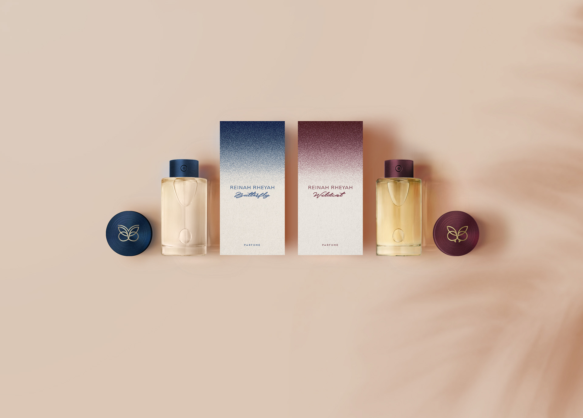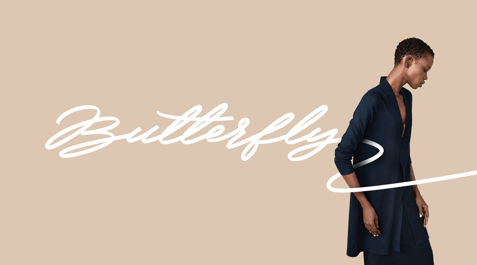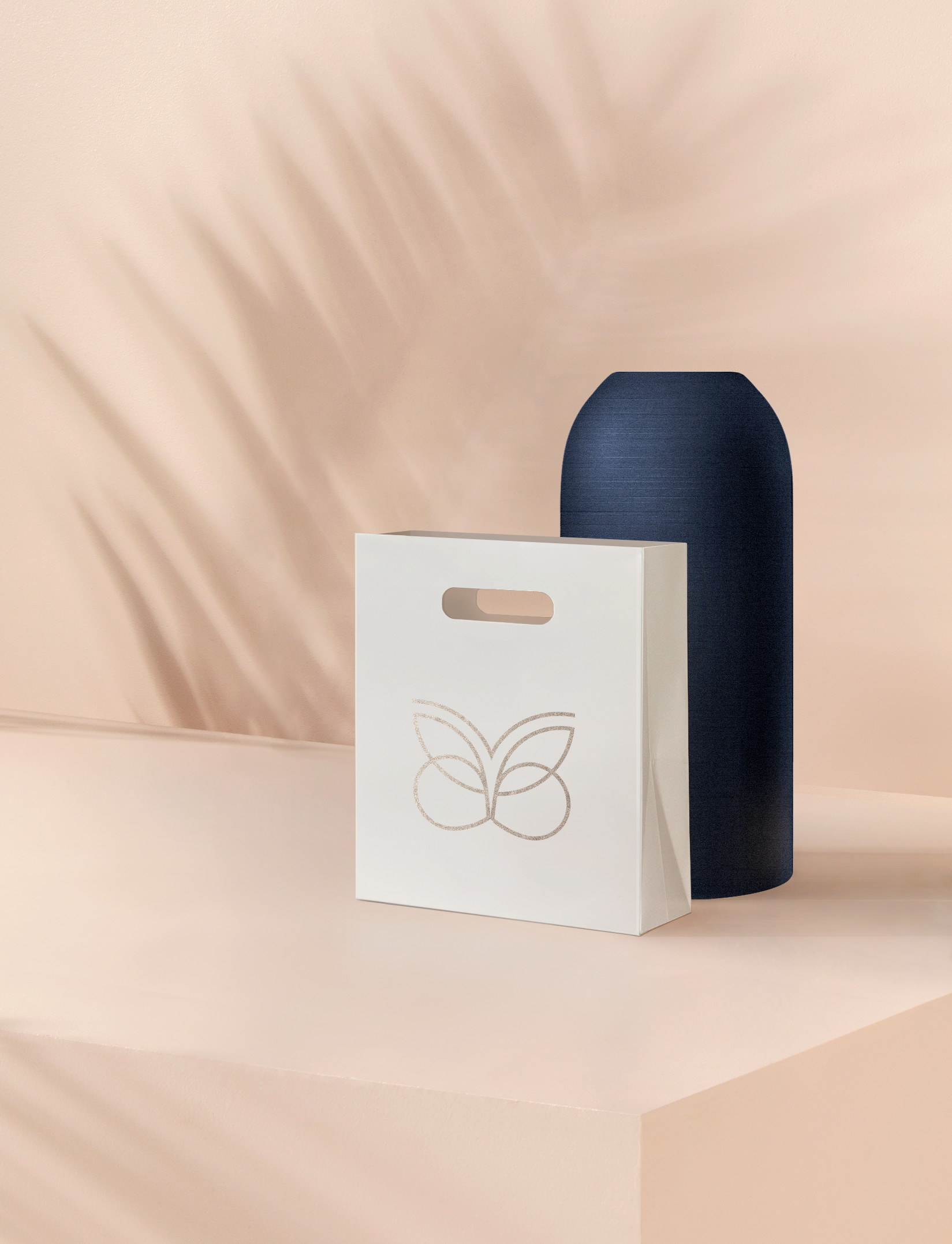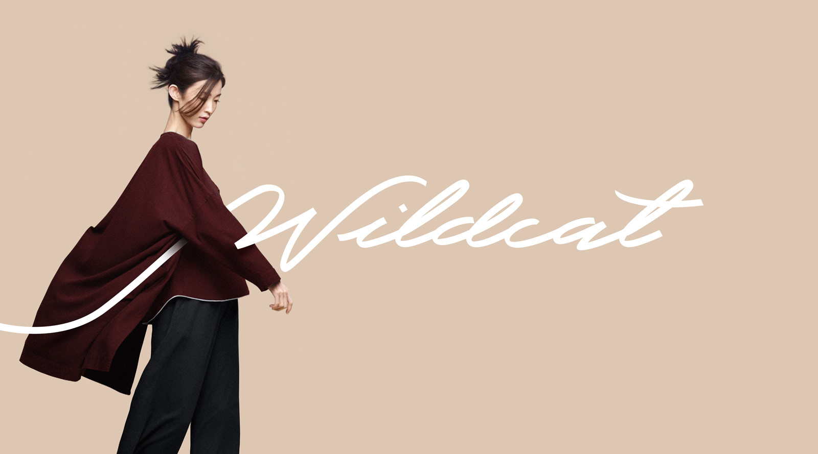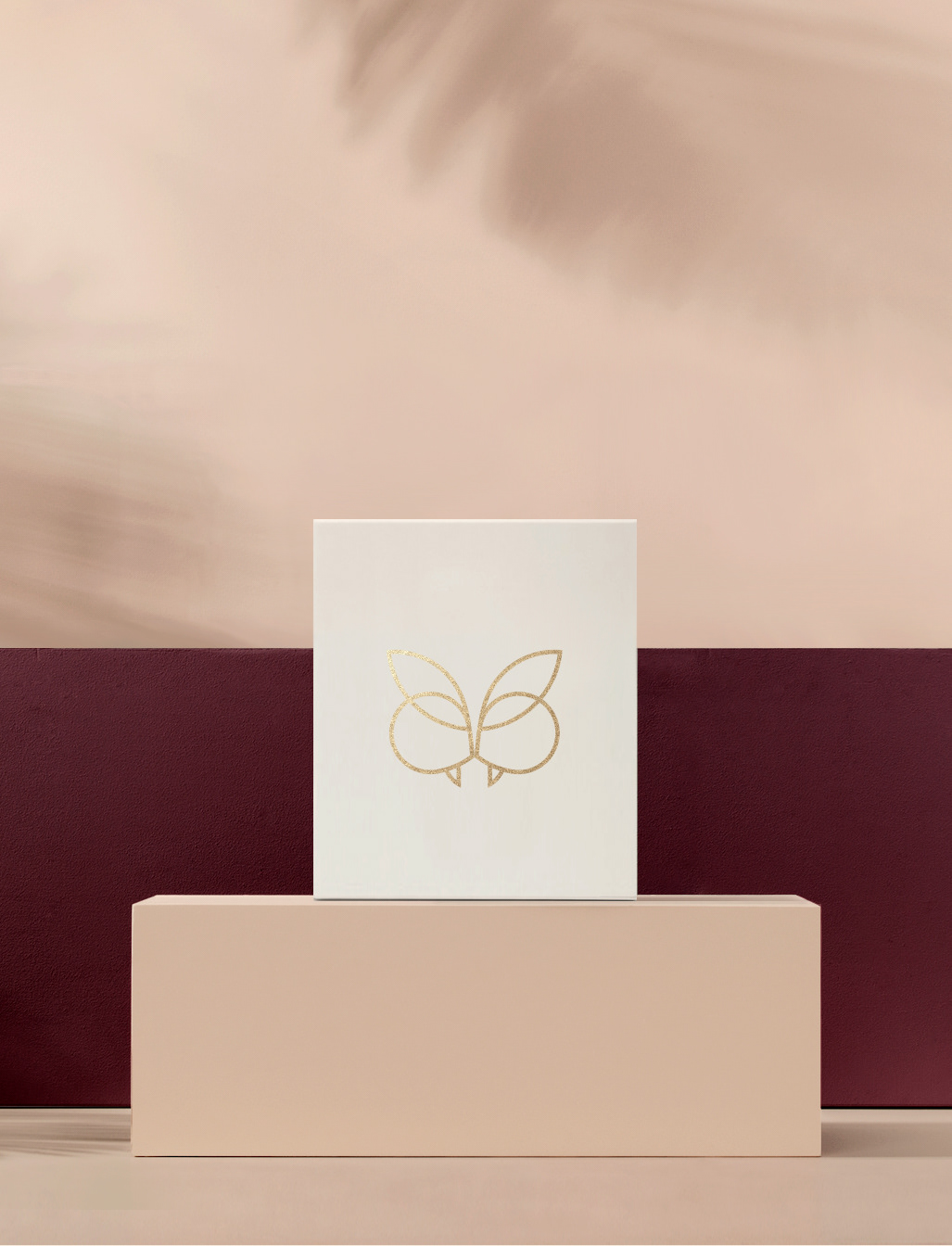


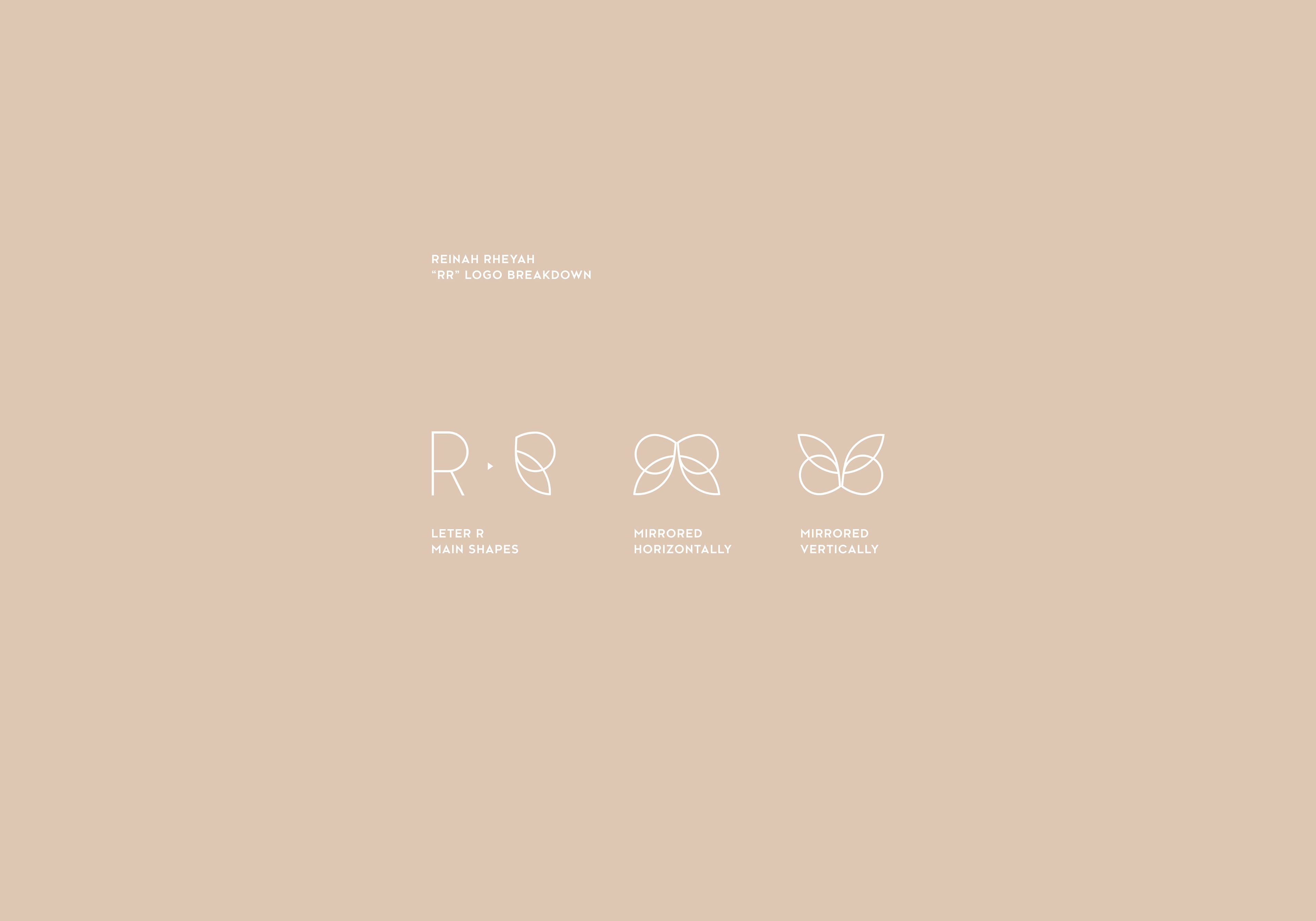
Regarding the main logo, the challenge was that it has to function as a base/fundament their upcoming parfume line's identity can be built on. Therefore the base logo will be the representative of the brand as a whole, while the alternate icons will be associated with the actual individual products they release along the road. So I designed a logo-system that is highly "modular" and can change its meaning by adding or removing secondary graphical elements yet remains 80% identical to its "parent logo". I made the "parent logo" to be less exact and the two "children logos" more illustrative as they bear characteristics of the two extremes in the diverse world of scents. The soft "Butterfly" is for the reserved, sophisticated ladies (fruity, powdery & floral), while the strong "Wildcat" is for the extrovert, playful women (woody, spicy & leathery).